Choosing tiles can feel confusing because most people look at tiles one by one. They like one floor tile, then one wall tile, then a highlighter tile — and suddenly the final space looks either too plain or too busy.
A better way to choose tiles is to build a tile color palette.
A tile palette helps you see the full space together. It gives every tile a clear role so the floor, walls, feature areas, niches, borders, grout and countertops all feel connected.
The easiest formula is:
The 3-Part Tile Color Palette Formula
- Base Tone + Accent + Contrast
- Sets the mood · Adds personality · Creates depth
Once you understand these three parts, tile selection becomes much simpler.
What Is a Tile Color Palette?
A tile color palette is the combination of tile tones, textures, finishes and details used in one space.
It is not only about color. In tiles, a palette can include:
- Plain tiles
- Marble-look tiles
- Stone-look tiles
- Fluted tiles
- Textured tiles
- Pattern tiles
- Glossy and matt finishes
- Grout color
- Border tiles
- Tiled niches
- Countertops or 15 mm slabs
The goal is to make all these elements work together instead of looking randomly selected.
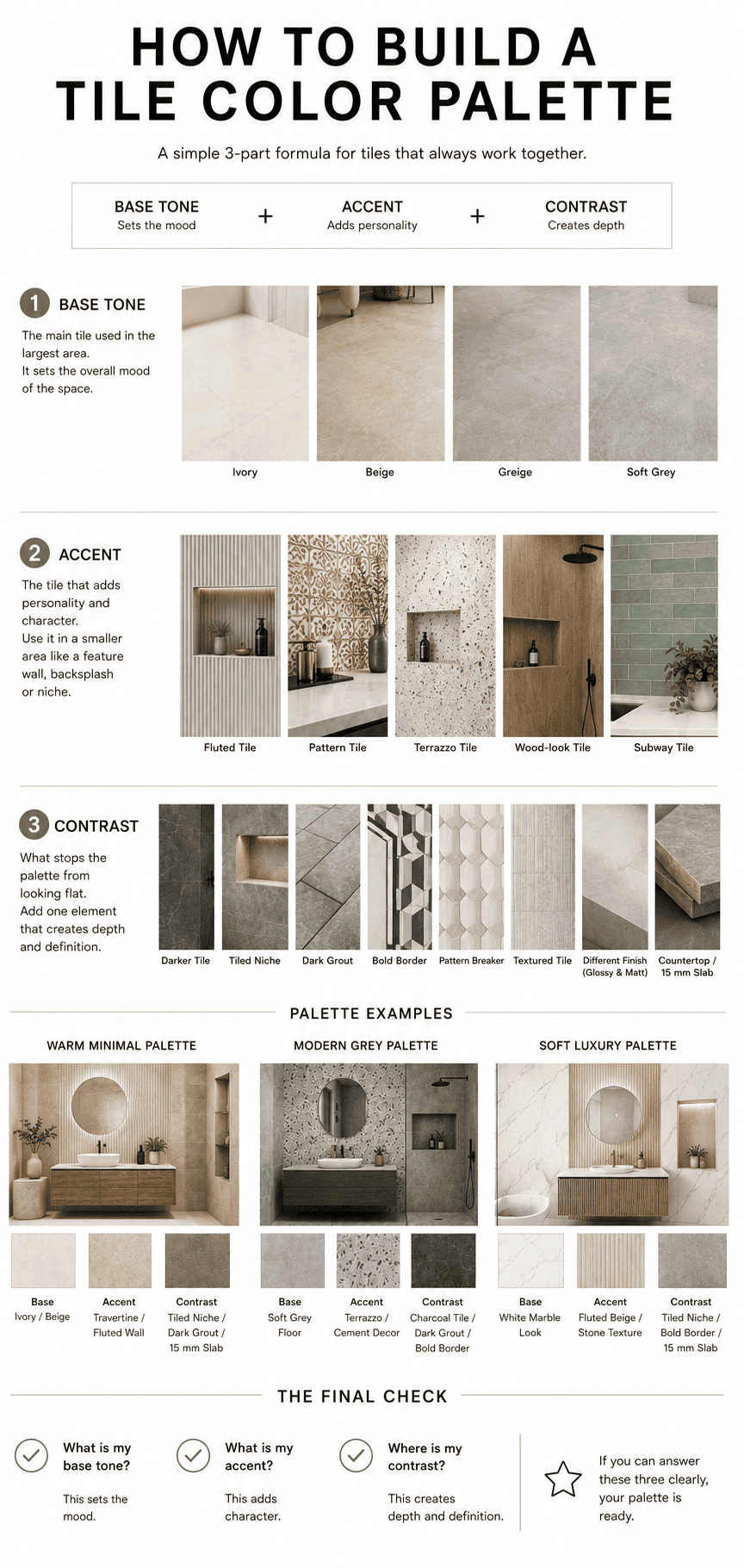
Step 1: Choose Your Base Tone
Your base tone is the main tile that covers the largest area.
This is usually the tile used on the floor, the main bathroom wall, the living room floor, the kitchen wall, or any large background surface. The base tone quietly controls the entire mood of the space.
For example:
- Ivory or off-white tiles make a space feel clean, open and bright.
- Warm beige tiles create a soft, calm and homely look.
- Greige tiles give a balanced look between warm and modern.
- Soft grey tiles create a more urban and minimal feel.
- Travertine or stone-look tiles make the space feel natural, premium and timeless.
Before choosing any accent or highlighter tile, always lock the base tone first. If the base tone is wrong, the entire space can feel disconnected even if the other tiles are beautiful.
A good base tile should not fight for attention. It should create the background on which the rest of the palette is built.
Step 2: Add One Accent Tile
Once the base tone is decided, the next step is to choose an accent tile — the tile that gives character to the space. Use it in a smaller, more focused area.
You can use an accent tile for:
- Bathroom feature wall
- Shower wall
- Tiled niche
- Kitchen backsplash
- TV wall
- Vanity wall
- Border area
- Highlight strip
- Entryway feature
An accent does not always have to be loud or colorful. It can be subtle and still make a strong impact. For example:
- Fluted tiles with plain tiles
- Textured tiles with smooth tiles
- Pattern tiles with neutral tiles
- Terrazzo tiles with plain base tiles
- Wood-look tiles with ivory or beige tiles
- A richer shade from the same color family
One good accent is better than three competing accents. When too many tiles are trying to become the highlight, the room starts looking crowded.
A well-designed palette usually has one clear accent area and the rest of the tiles support it.
Step 3: Add Contrast
Contrast is what stops the tile palette from looking flat.
Many people think contrast means adding a completely dark tile, but that is not always necessary. In tile design, contrast can come from color, finish, texture, pattern, grout or layout.
You can create contrast with:
- A darker tile
- A tiled niche
- Dark grout
- A bold border
- A pattern breaker
- Textured tiles
- A different finish in the same space (glossy with matt)
- A countertop or 15 mm slab
Contrast does not need to be dramatic. It just needs to create depth and definition. Without contrast, even expensive tiles can look flat. With the right contrast, a simple tile palette can look thoughtfully designed.
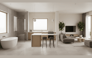
Seeing the Formula in a Real Bathroom
The image below shows exactly how Base Tone, Accent and Contrast come together in a finished bathroom space.
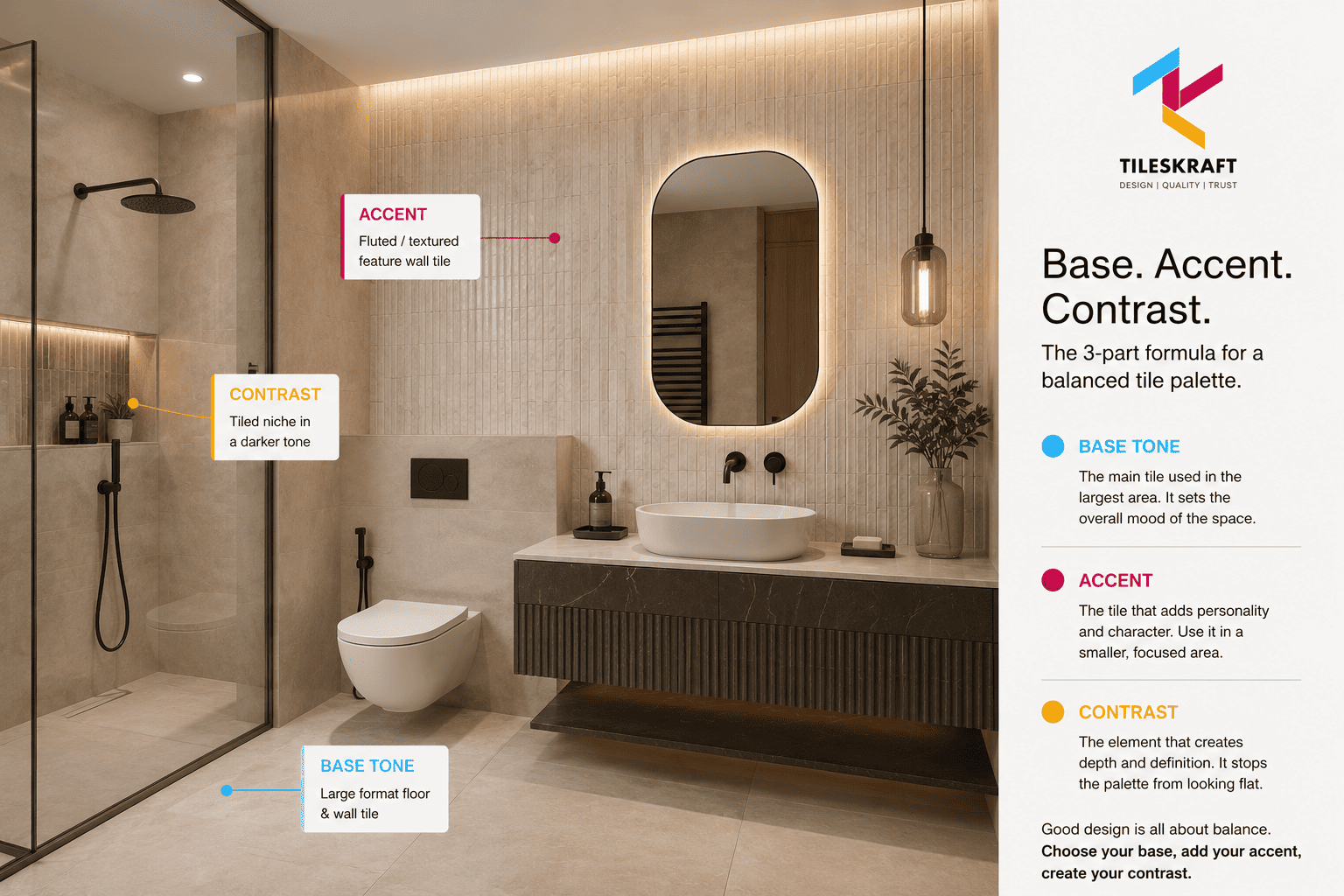
Notice how each tile has a clear role. The warm beige large-format tile covers the floor and most walls — this is the base tone. The fluted, textured tile on the feature wall adds personality — this is the accent. The tiled shower niche in a slightly deeper tone adds depth without competing — this is the contrast.
Three Ready-to-Use Tile Palette Examples
Example 1: Warm Minimal Tile Palette
A warm minimal palette works well for bathrooms, bedrooms, living rooms and calm residential spaces.
- Base tone: Warm ivory or beige tile
- Accent: Travertine-look tile, fluted tile or subtle texture
- Contrast: Dark grout, tiled niche, deeper beige border or 15 mm slab
This palette feels soft, premium and timeless. It is a good choice when you want the space to look elegant without becoming too loud.
Example 2: Modern Grey Tile Palette
A grey palette works well for modern homes, commercial spaces, offices and minimal bathrooms.
- Base tone: Soft grey floor or wall tile
- Accent: Cement-look tile, terrazzo tile or textured grey tile
- Contrast: Charcoal tile, dark grout, bold border or matt-glossy finish mix
This palette feels clean, structured and urban. To avoid making the space feel cold, choose the right undertone of grey and add texture wherever needed.
Example 3: Soft Luxury Tile Palette
A soft luxury palette works beautifully in bathrooms, powder rooms, living rooms and hotel-style interiors.
- Base tone: White marble-look tile or soft ivory tile
- Accent: Fluted beige tile, subtle stone-look tile or textured tile
- Contrast: Tiled niche, bold border, dark grout or countertop slab
This palette creates a polished and premium look without using too many different tiles.
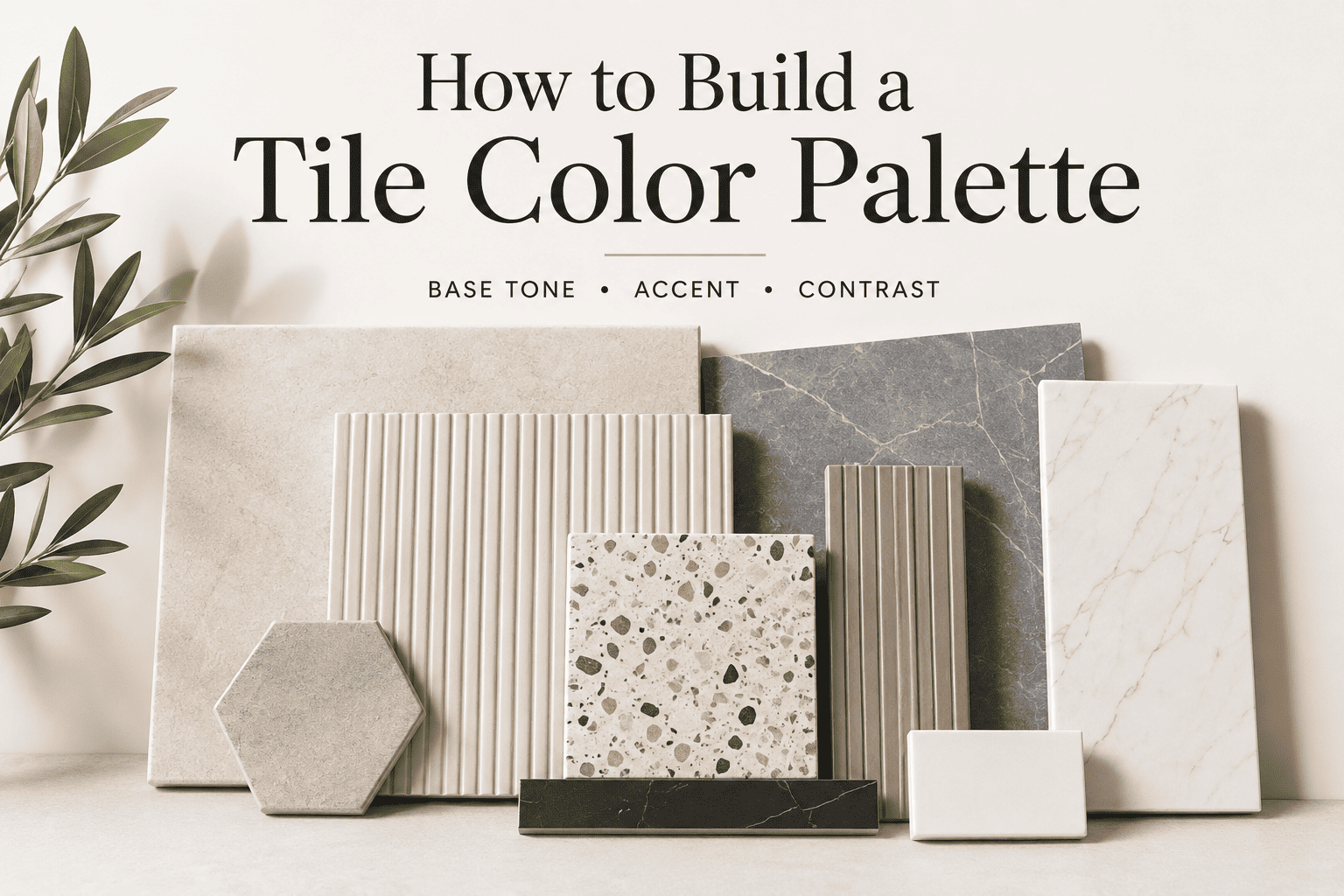
Complete Tile Color Palette Guide (Infographic)
The infographic below summarises the full formula — base tone options, accent tile types, contrast methods and all three palette examples — in one easy reference you can save or share.
Common Mistakes to Avoid While Building a Tile Palette
Choosing every tile separately
A floor tile may look good alone. A wall tile may look good alone. A highlighter tile may look good alone. But they still may not work together. Always see them as one palette before finalising.
Using too many accents
If every wall has a different highlight, the space loses balance. Keep one main accent and let the rest of the tiles support it.
Ignoring grout color
Grout can change the final look of the tile. Matching grout gives a seamless look, while dark grout creates definition and contrast.
Forgetting texture and finish
Color is only one part of the palette. Matt, glossy, textured, fluted and stone finishes can completely change the mood of the space.
No contrast at all
A completely plain palette can look unfinished. Even a small contrast element — like a tiled niche or bold border — can make the space look more intentional.
Final Checklist Before You Finalise Your Tiles
What is my base tone? — The main tile that sets the mood of the space.
What is my accent? — The tile that adds personality, used in one focused area.
Where is my contrast? — The element (texture, grout, niche, border, slab) that creates depth and prevents the palette from looking flat.
If you can answer these three questions clearly, your tile color palette is already more balanced than most tile selections.
Frequently Asked Questions About Tile Color Palettes
What is a tile color palette?
A tile color palette is the complete combination of tile tones, textures, finishes and details chosen for one space. It includes everything from floor tiles and wall tiles to grout color, borders, niches and countertops — all selected to work together as a single, cohesive look.
What is the base tone in a tile palette?
The base tone is the main tile that covers the largest area in your space — typically the floor or the main wall. It sets the overall mood. Common base tones include ivory, warm beige, greige, soft grey and travertine-look tiles.
How many accent tiles should I use in a room?
One accent tile is enough. Use it in a single focused area such as a feature wall, shower wall, backsplash, or tiled niche. Using more than one accent in the same space often makes the room feel busy and unbalanced.
How do I add contrast without using very dark tiles?
Contrast can come from many sources beyond dark tiles — including dark grout, a tiled niche, textured tiles, a bold border, a mix of matt and glossy finishes, or a countertop slab. Even a slightly deeper grout or a fluted niche can create depth and make the space feel more designed.
Can the same tile palette formula work for bathrooms and living rooms?
Yes. The Base Tone + Accent + Contrast formula works across all rooms. The tiles and finishes will differ based on whether it is a wet area or a dry space, but the structure — one base, one accent, one contrast — stays the same regardless of room type.
Conclusion
A good tile selection is not about choosing the most beautiful tile in the showroom. It is about choosing tiles that work together.
Start with a base tone that sets the mood. Add one accent that gives the space character. Then create contrast through texture, finish, grout, pattern, border, niche or slab.
That is how you build a tile color palette that looks balanced, practical and well-designed.